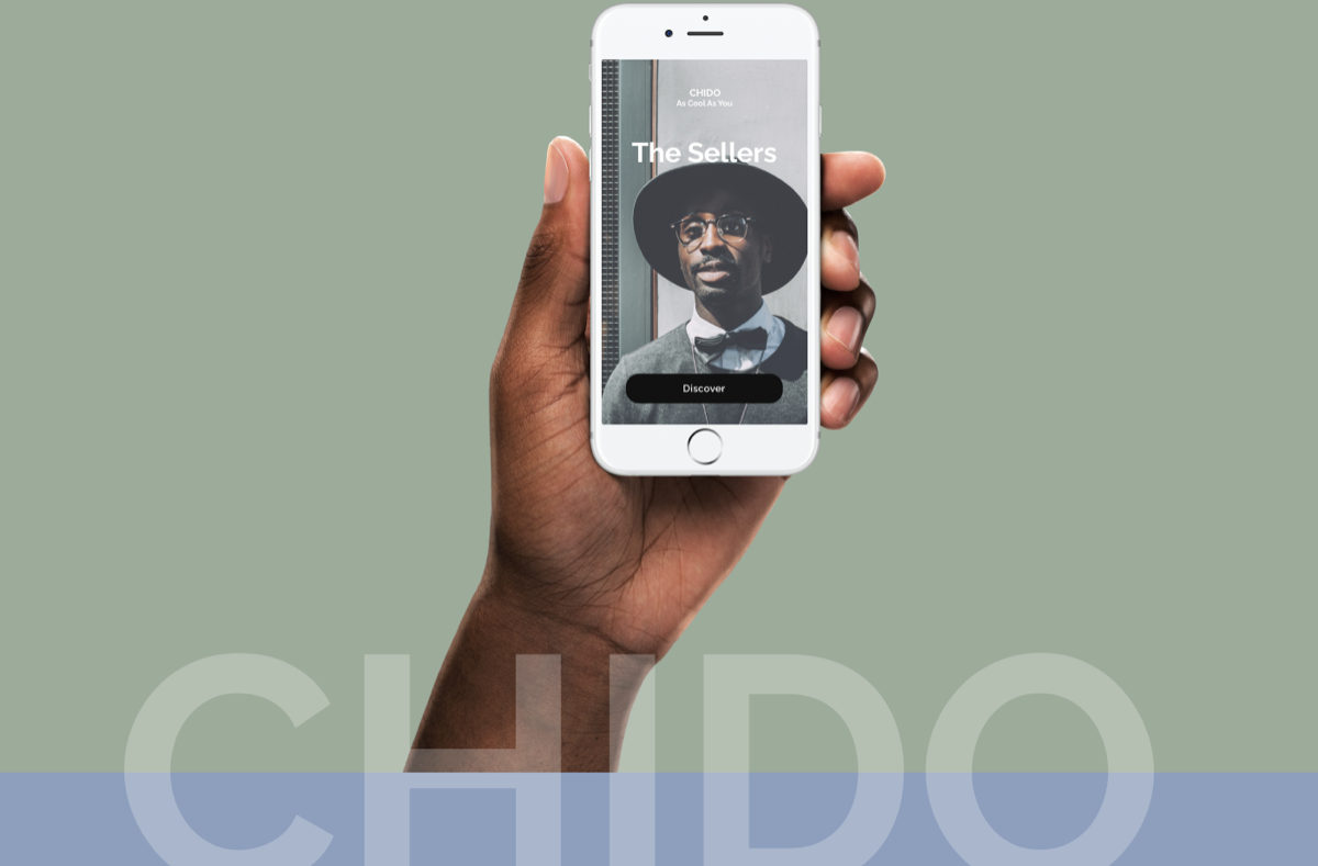
Chido is an online marketplace that is for buying and selling pre-owned items exclusively for men. Chido authenticates the products, providing valuable pieces, from mid to high/end brands and encouraging a sustainable and conscious shopping experience.
I started the project by doing a competitive analysis, in order to understand where Chido stands in the market and, to identify the strength and weaknesses of my competitors. I have performed the analysis of 3 apps: HEROINE; VESTIAIRE COLLECTIVE and DEPOP, looking at Design Principles and Heuristics as well as consistency in the pattern across products. PROBLEM: lack of a dedicated channel to embrace sustainable fashion consumption, tailored specifically around men. SOLUTION: to design the UI and UX for the mobile version of a vintage clothing sales app, taking into account usability, accessibility, intuitive navigation and creating minimalistic layouts with a focus on the products on sale, just for men.
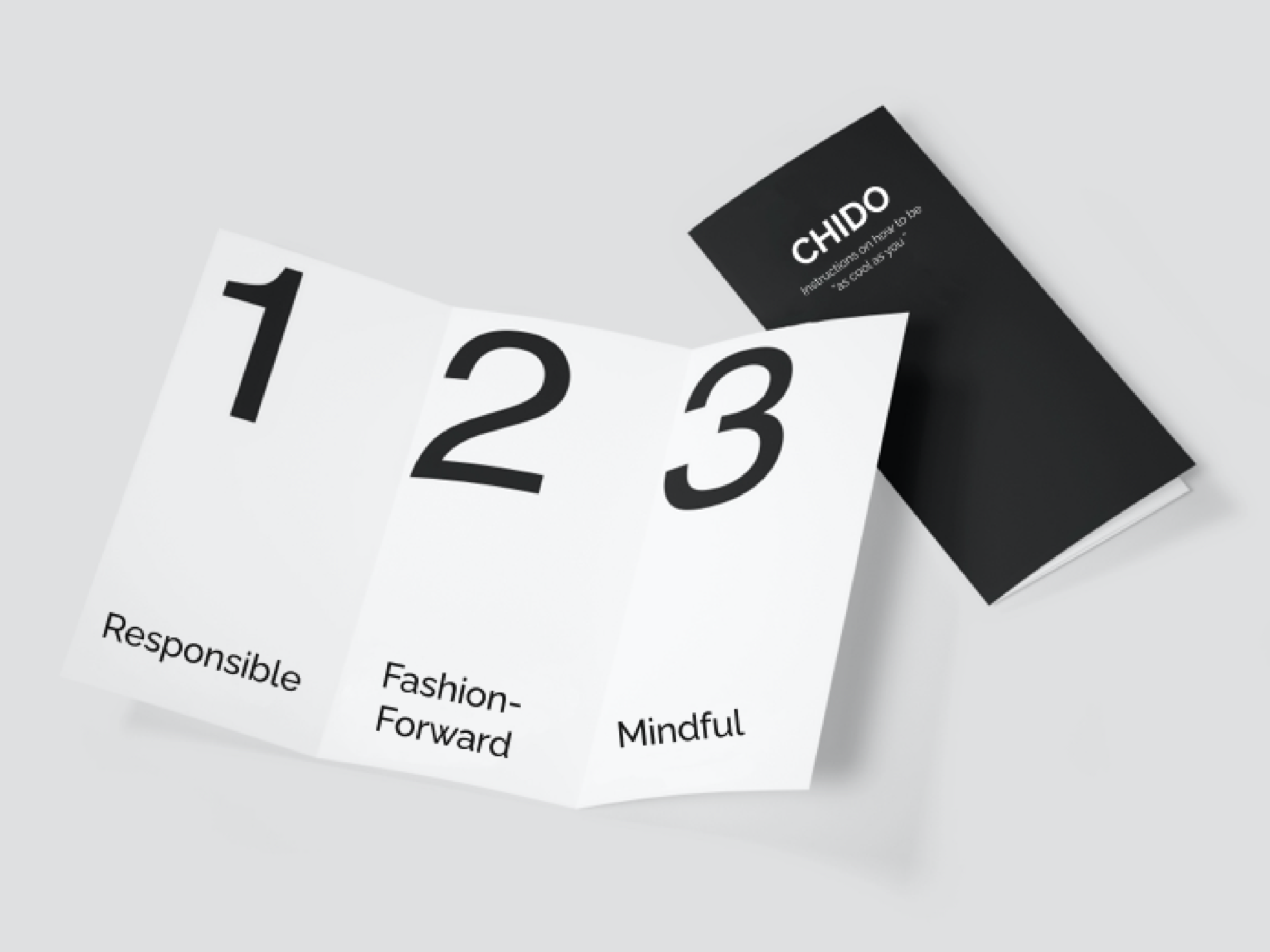
Once I established the brand, I started defining the UX foundation of the product. I have chosen my target user and the primary user stories based on the brief given. TARGET: Men aged 35 to 55, who have an affinity for luxury brands, street-style and sustainable labels. Users of Chido are buyers and sellers. They want to be part of a community of people who invest in valuable pieces and prolong the life of fashion items with the environment in mind. VALUES: I have ientified the core values tof Chido. This values will constantly remind the users what’s important to my brand and to the people the app is serving.
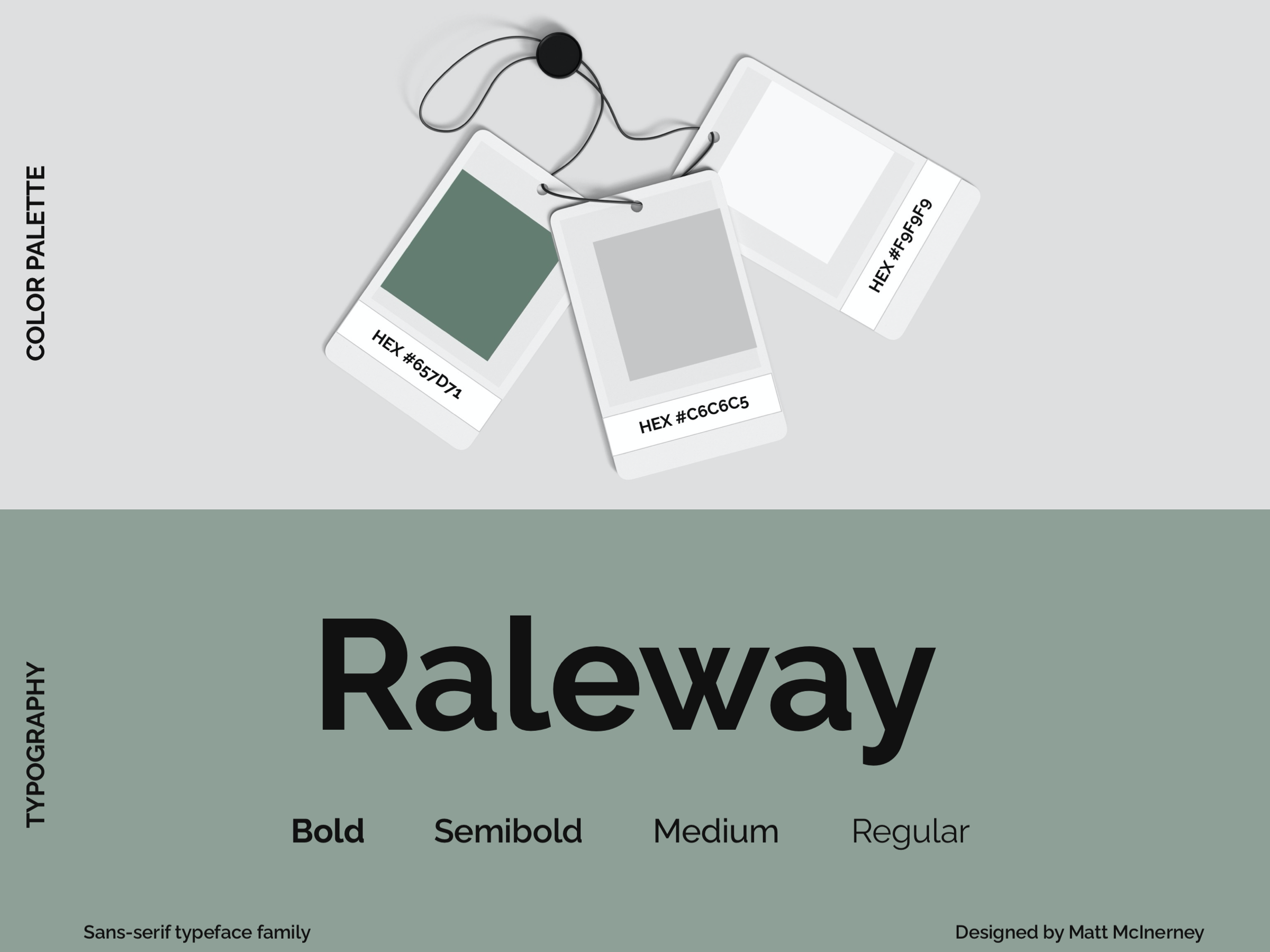
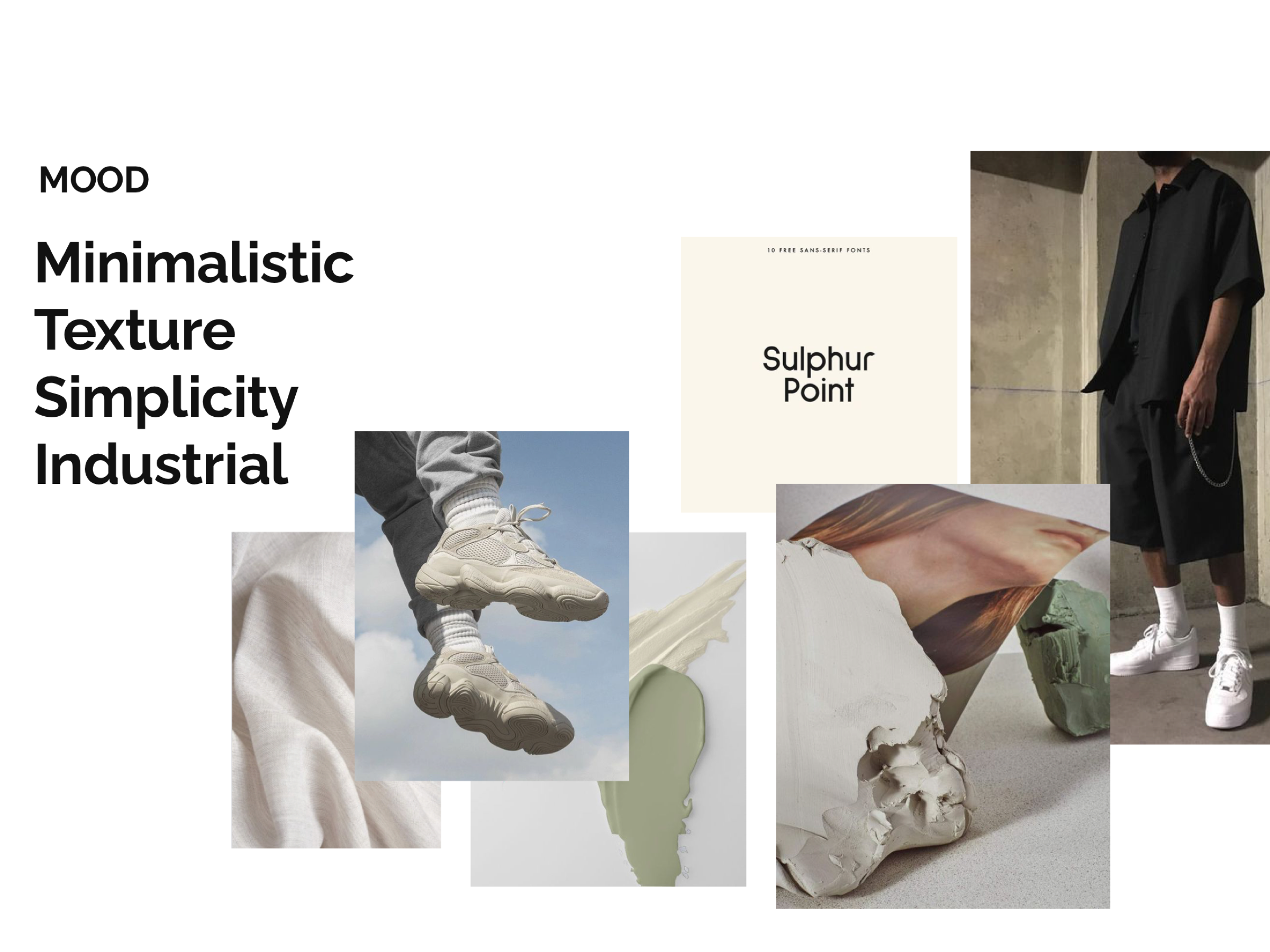
I have chosen to call the app “Chido” which mean “cool” in English. The aim was to redefine vintage as something modern and trendy. I have created a design system and branding guidelines that I have implemented across the app. I used negative space and symmetry to give it a minimal yet eye-catching look. My vision for the colour palette was neutral, genderless tones, related to nature.
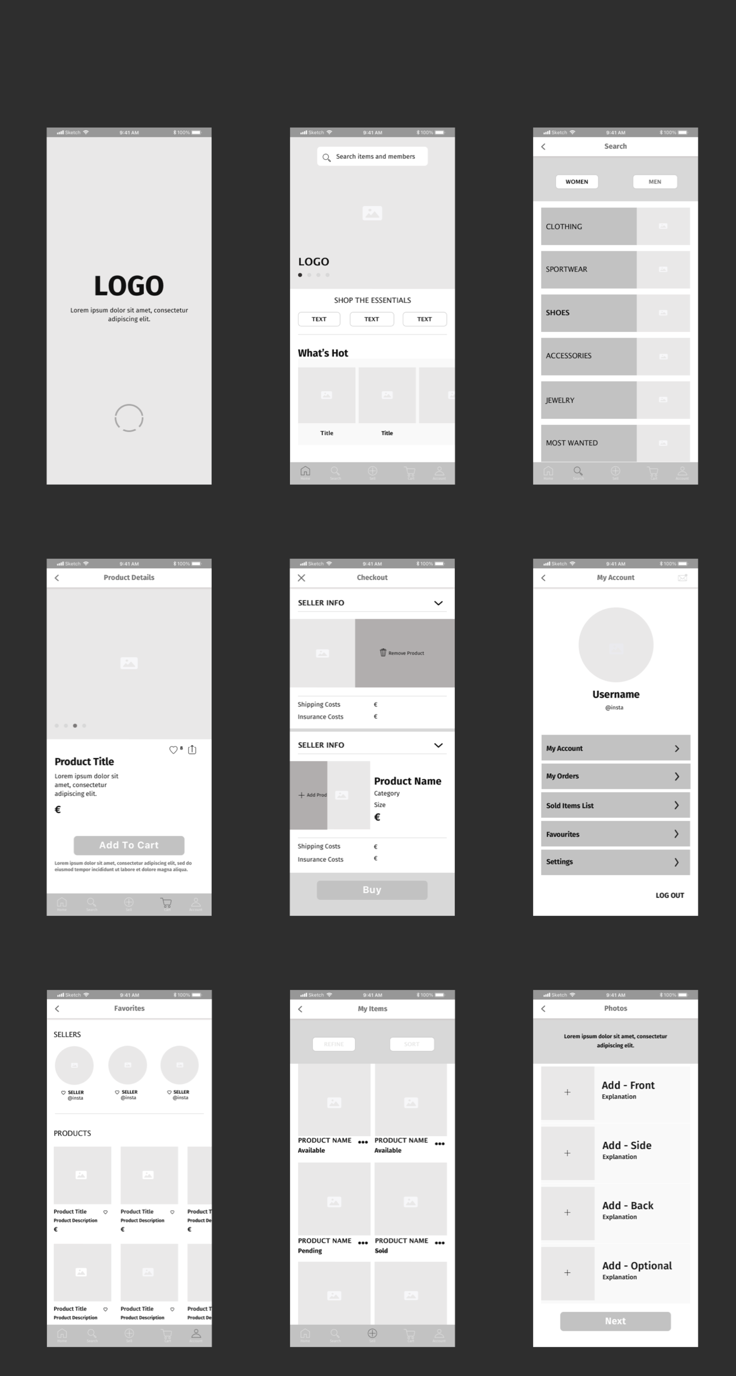
The app has been re-designed from scratch, after completing my UI Immersion course. I have decided to implement patterns that I have learnt in my previous assignments and to refine the product by making it more efficient, easy to use and aesthetically pleasant. I have started by sketching the wireframes and then, I switched to digital to create mid and high-fidelity wireframes, containing all the main breakpoints for the product.
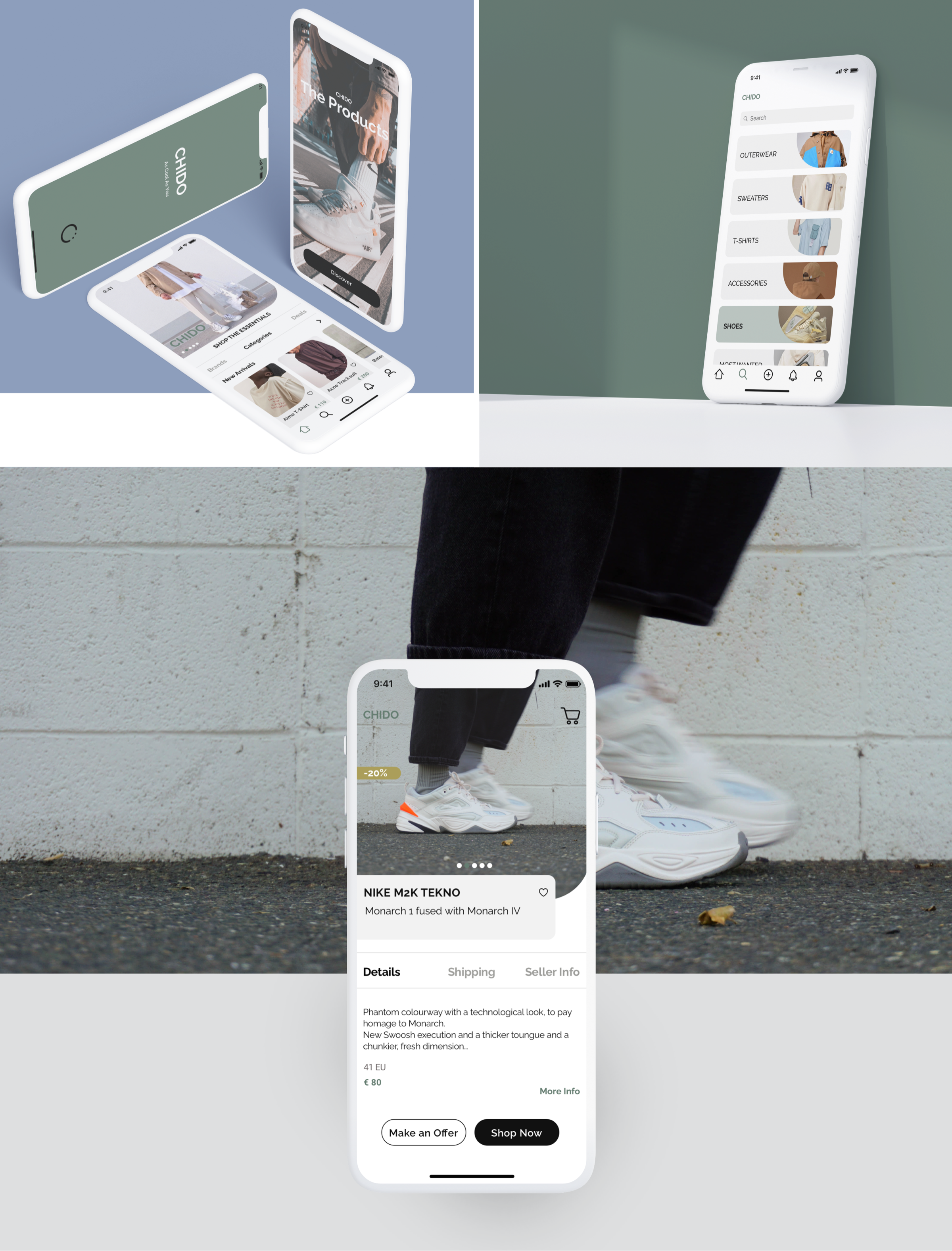
In total I have designed 12 screen per breakpoint, following the design requirement and the design constraints for the project : REQUIREMENTS: -Content aligned with a well-defined grid system -Appropriate and consistent spacing of elements -Clear and effective visual hierarchy -Consistent use of known UI elements -Icons clearly communicating the actions they are referring to CONSTRAINTS: -2 colour palettes including HSL, HEX, and RGB codes -Complete UI design (4+ screens) with one of the colour palettes applied
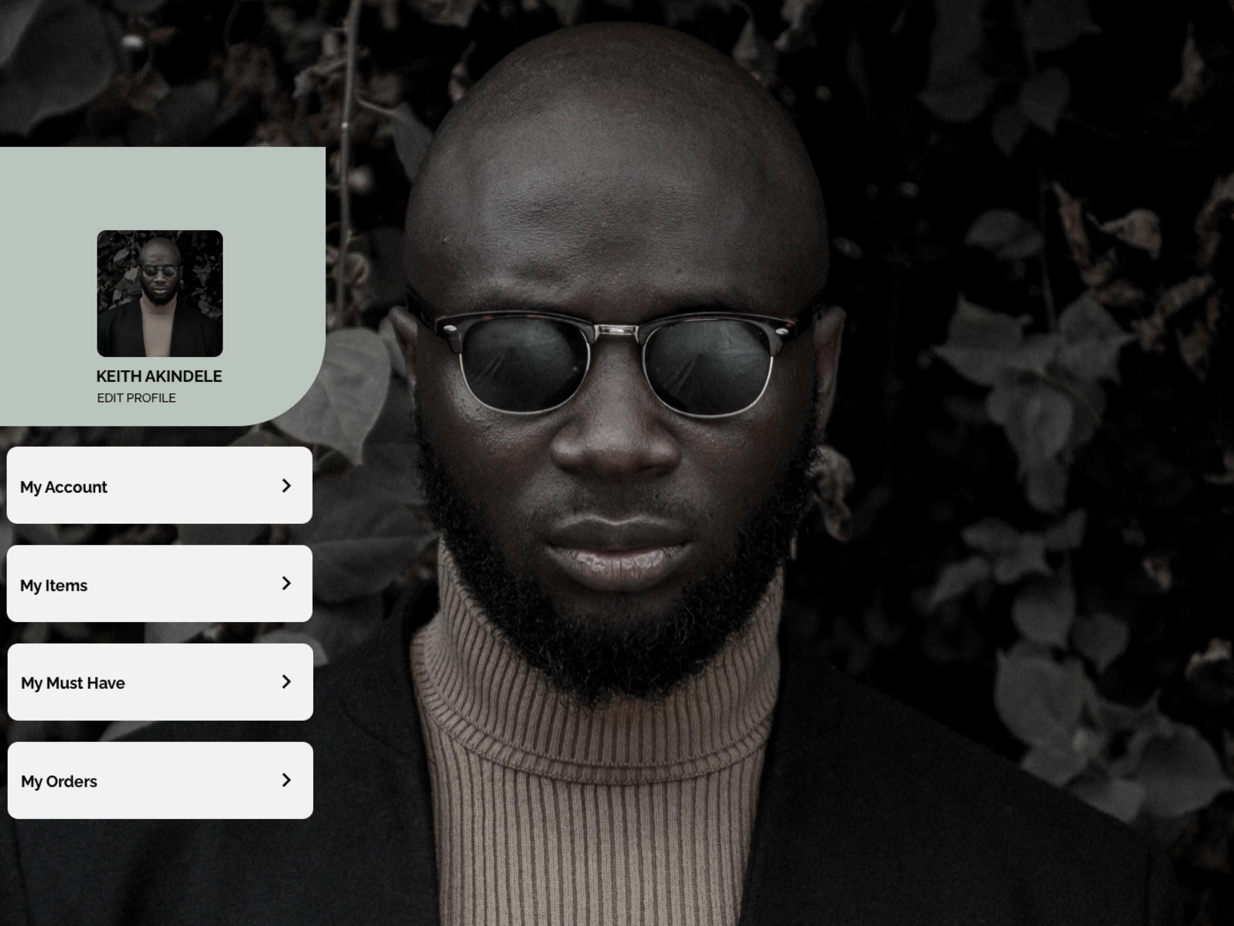
Shopping in stores can be a pretty overwhelming experience, especially for men, in fact, researches show that men are more likely to respond to more utilitarian aspects of the experience. They aren't into taking their time to walk around a dozen of stores, instead, they want to find what they need, pay and leave. Chido has been designed as a simple app system, dedicated to men, would help the quality control and authentication of the merchandise, it would make “resale” a trendy and sustainable experience for the users, and moreover, it will make the shopping process smoother by providing a personalised experience, with quick access to favourite categories and sellers.